Most traders mark support and resistance the same way — they scroll back on the chart, spot a few places where price bounced, draw horizontal lines across them, and call it a “key level.” Then they wonder why price blows straight through half of them without hesitation.
Here's the harsh reality: not every level on your chart matters. Most of them are dead. And until you know how to tell the difference between a level that's actually live and one that's just old noise sitting on your screen, you're going to keep getting faked out and stopped out prematurely.
Core Foundation Principle
“This is where swing highs and swing lows come in — and it's the very first thing I teach in the Price Action Mastery programme, because everything else we build after this depends on getting it right.”
What Actually Makes a Swing High or Swing Low
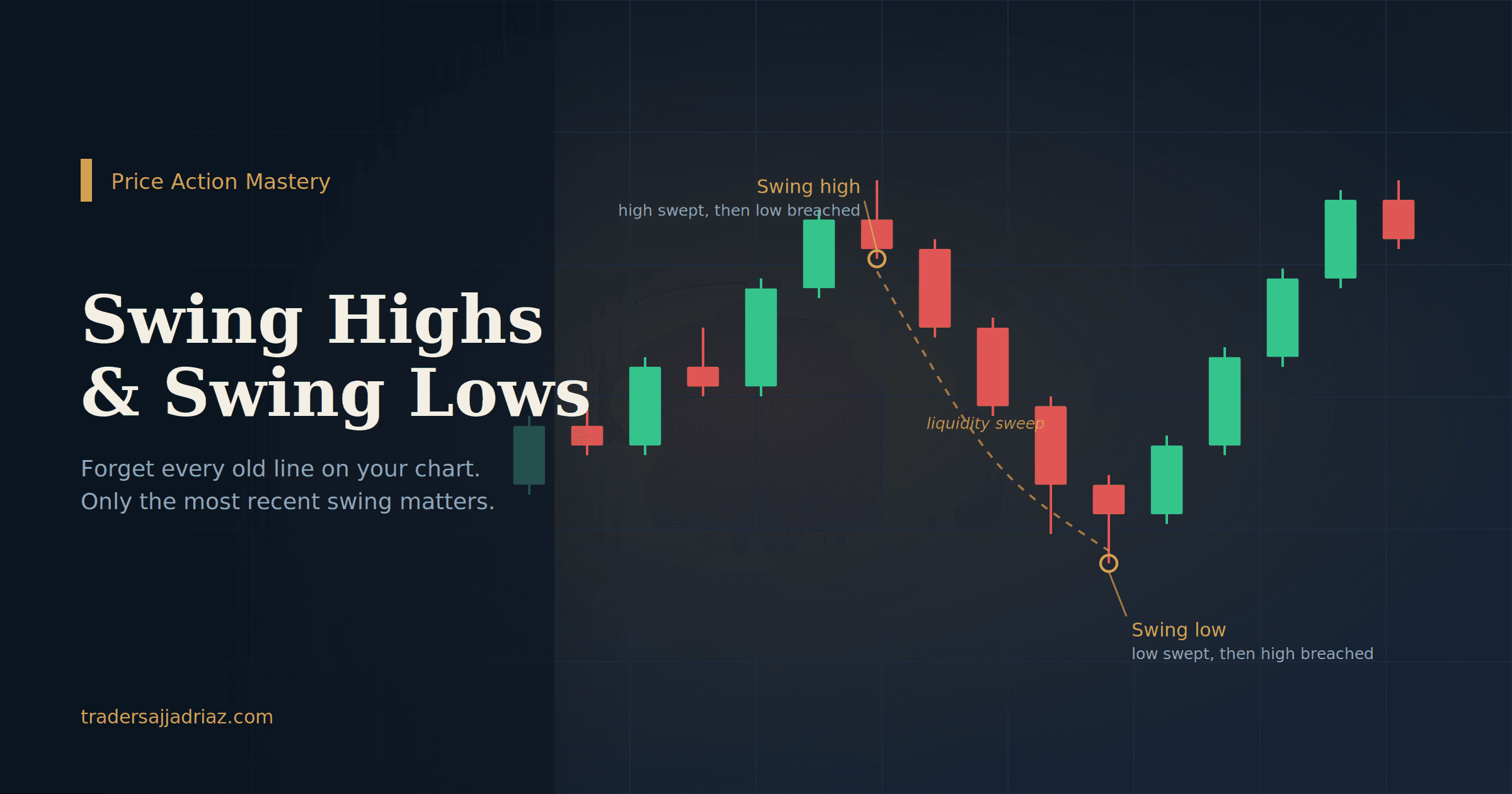
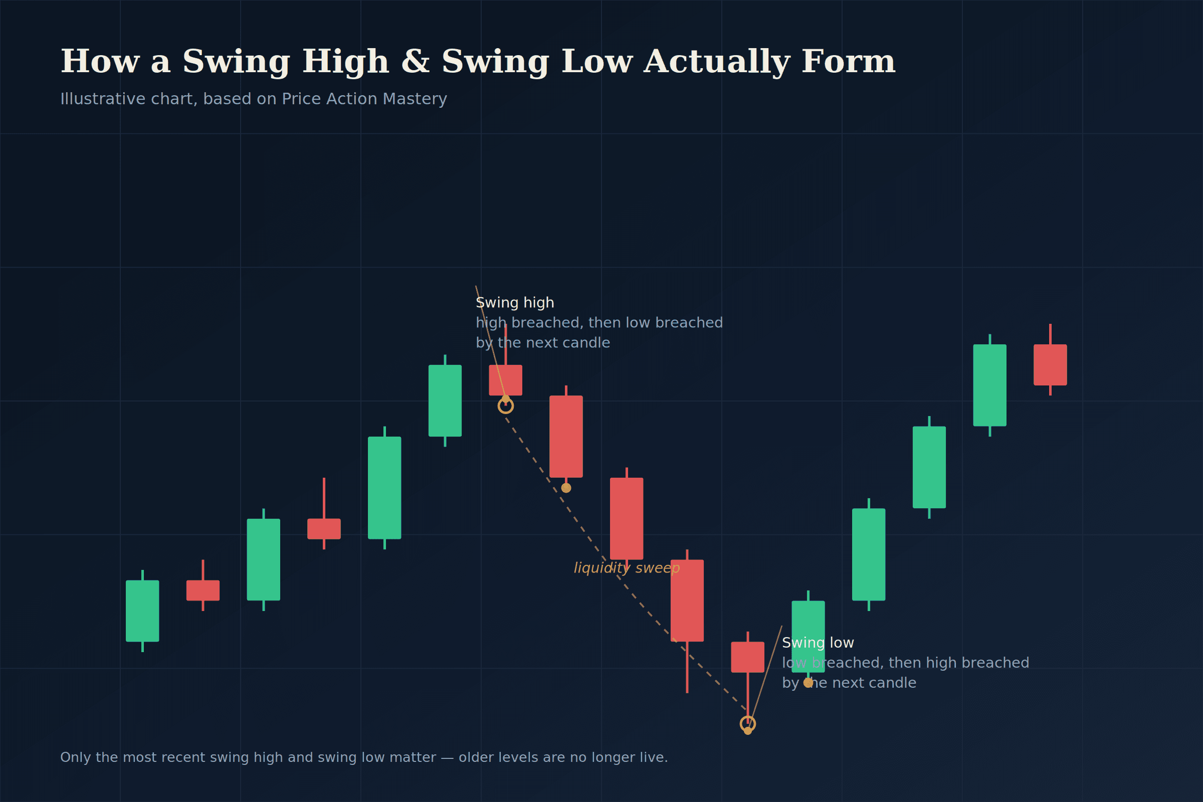
Forget indicators for a second. A swing high is simple and objective: it's a candle whose high gets breached — swept, purged, penetrated, whatever word you want to use — by the next candle, and then that next candle's low also gets taken out by the one after it.
- Left Candle: Forms a lower high.
- Middle Candle: Highest peak that breaches the left high.
- Right Candle: Breaks the middle candle's low.
- Left Candle: Forms a higher low.
- Middle Candle: Lowest trough that breaches the left low.
- Right Candle: Breaks the middle candle's high.
People overcomplicate this. It's not about a perfect V-shape or a textbook pattern. It's about whether the candle's high (or low) actually got taken — closed through it, or wicked through and closed back, either way counts as a breach. Once you can spot that reliably, you're looking at the market very differently than someone drawing lines by eye.
Why Most of Your “Support and Resistance” Is Useless
Here's the part that changes how you see a chart permanently: only the most recent swing high and the most recent swing low actually matter. Everything before that is dead weight.
I know that's uncomfortable to hear if you've spent months marking every swing on your chart going back a year. But think about it — swing points keep shifting as new candles form. The old high you marked three weeks ago got replaced the moment a new, more recent swing high formed. Trading off that old level is like negotiating a price based on last month's news. It's stale.
Chart Analysis: Germany 40 (DAX) & Range Dynamics
When I pulled up the DAX (Germany 40) on the one-year chart in the lesson, this was the exact point — you don't need to go hunting for every historical bounce. You need the current swing high and the current swing low, full stop. That's your range. That's what's actually live right now.
The Real Mechanic Behind Reversals
This is the concept most retail education skips entirely, or gets backwards: when the liquidity sitting at a swing low gets swept, price tends to move toward the swing high. When the swing high gets swept, price tends to head back down toward the swing low.
“Resistance broke, so it immediately flips to support.” In reality, this retail logic gets trap-swept frequently by institutional order flow.
Price seeks liquidity. Once resting stops on one side are triggered (purged/swept), the market goes hunting for resting liquidity on the opposite extreme.
In my experience, that retail RBS/SBR framing doesn't hold up nearly as often as people think. What actually moves price with more consistency is liquidity — one side gets taken, and the market goes hunting on the other side. Once you start watching swing points through that lens instead of just “line broke, now it's the opposite,” your read on the chart gets sharper fast.
Your Timeframe Has a Boss
One more piece from this lesson that trips people up: timeframes aren't independent of each other. There's a hierarchy, and ignoring it is one of the fastest ways to get chopped up in a trade that looked perfect on your entry timeframe but was fighting the bigger trend the whole time.
“Think of it like a family — grandfather, father, son standing in a room. Whose opinion carries more weight? The higher up the chain you go, the more it matters. Same with timeframes. If your monthly chart is telling you one story, your weekly and daily better be listening to it, not contradicting it.”
| Dominant Higher Timeframe | Aligned Execution / Structure Timeframe | Purpose & Role |
|---|---|---|
| Monthly (1M) | Daily (1D) | Macro Directional Bias & Key Ranges |
| Weekly (1W) | 4-Hour (4H) | Intermediate Structure & Liquidity Legs |
| Daily (1D) | 1-Hour (1H) | Intraday Order Flow & Range Shifts |
| 4-Hour (4H) | 15-Minute (15M) | Execution & Entry Trigger Confirmation |
Strict Rule: 4H is as low as we go for structural analysis — no exceptions. It's not a suggestion, it's a rule, because once you start dropping below that you're reacting to market noise instead of true structure.
Why This Matters Before Anything Else
I haven't taught you how to actually place a trade yet in this lesson, and that's on purpose. Before you can build a system around liquidity sweeps, order flow, or any of the models we get into later, you need to be able to look at a chart and immediately identify:
Get that foundation solid, and everything we build on top of it — liquidity runs versus sweeps, FVG behavior, the AMD model — actually makes sense instead of feeling like a list of rules to memorize.
Your Homework: Chart Reading Without Guesswork
Take a physical notebook. Open your charts on the Daily and 4H timeframes. Mark up the charts yourself: find the current swing highs, find the current swing lows, and start noticing how often price respects the current range instead of some old level from months ago. That's the whole game at this stage — nothing more.